Espera unos segundos se esta Cargando...

Cómo hacer Blogger Plantilla Responsive

3 de agosto de 2016


Una plantilla sensible blogger también la gran parte de blogger SEO, hoy en día todos los que usan los navegadores móviles, me refiero a decir que la mayoría de los usuarios son procedentes de una plataforma móvil, por lo que es necesario tener la Plantilla Blogger Responsive.

Blogger Plantilla Responsive


  1. Vaya al escritorio de Blogger ► Plantilla.
  2. Haga clic en el icono de engranaje para el móvil.
  3. A continuación, seleccione ". Mostrar plantilla móvil en los dispositivos móviles. "Y elegir el tema.(Personalizado)
  4. Haga clic en el botón de guardar.


Veamos ahora unos detalles más técnicos de cómo se crearía una media query. Siempre que este familiarizado con las hojas de estilo resultará sencillo. Simplemente se trata de declarar las reglas específicas para cada tamaño dentro de una declaración con esta forma:

@media only screen and (max-width: 480px) { … }

Podemos especificar más dándole un ancho máximo y mínimo, por ejemplo:

@media only screen and (min-width: 480px) and (max-width: 768px) { … }

Dentro de los corchetes ubicaremos las reglas específicas de cada medida. No hay consenso sobre los puntos de cambio de las reglas, pero una definición lógica podría ser:

Móviles: max-width:480px

Tableta: min-witdh:480px and max-width: 800px

Desktop: min-witdh:800px and max-width: 1200px

Desktop de alta resolución: min-width:1200px


Para aplicarlo en la plantilla


  • Ir a la plantilla ► Editar HTML.
  • En el buscador ► Presionando CTRL+F pegar </head>


Sobre/arriba/encima pegar el siguiente código.


<!-- Plantilla Responsive -->
<style type='text/css'>
@media screen and (max-width:1024px){
body,.content-outer, .content-fauxcolumn-outer, .region-inner {width: 100%!important;min-width:100%!important;padding:0!important}
body .navbar {height: 0!important;}
.footer-inner {padding: 30px 0px!important;}
}
@media screen and (max-width: 603px){
.main-inner .columns {padding-right: 0!important;}
.main-inner .column-right-outer {width: 100%!important;margin-right: 0!important;}
}
@media only screen and (max-width:979px){
.main-inner .columns {padding-right: 0!important;}
.main-inner .column-right-outer{width: 100%!important;margin-right: 0!important;}
}
</style>


Presiona Vista previa y si esta todo en orden Guarda la plantilla y tendrás tu Plantilla del blog Responsive.

Para verificar escribir  http://Nombre del blog.blogspot.com/?m=1.

 Pruebalo en Troy test responsive

Leer más

Menú desplegable responsive con iconos sociales en Blogger


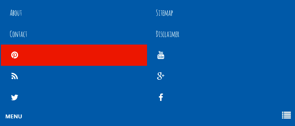
Para crear un menú desplegable responsive con iconos sociales en el blog de Blogger que nos proporciona flexibilidad para diferentes tamaños de pantalla.

Menú desplegable responsive

  • Ir a la plantilla ► Editar HTML.
  • En el buscador ► Presionando CTRL+F  pegar </head>

Sobre/arriba/encima pegar el siguiente código.


<style>
/*Menú desplegable responsive*/
.menu-wrapper {background:#2980b9;position:relative;z-index:96;overflow:hidden;margin:0 auto;padding:5px;}
.top-menu {display:block; margin:0 auto;float:left;padding:0;width:100%; background:transparent; border:none;}
.top-menu ul {width:100%;padding:0;margin:0;text-align:left;}
.top-menu li {list-style-type:none;float:left;padding:0;margin:0;}
.top-menu li a {position:relative;font-family: 'Amatica SC', cursive;font-size:18px;font-weight:400;background-color:transparent;color:#fff;display:block;margin:0;padding:8px 12px;line-height:100%;transition:color 0.3s;}
.top-menu ul li a:active, .top-menu ul li.highlight a {line-height:100%;text-decoration:none;}
.top-menu ul li a:hover {background:#ef4824;color:#fff;text-decoration:none;}
.top-menu li.socialwrap {float:right;}
.top-menu li.socialwrap a i{text-align:center;color:#fff;transition:initial;}
.top-menu li.socialwrap a:hover{background:#ef4824;color:#fff;}
.top-menu li.socialwrap.pinterest {border-right:0;}
.top-menu a#pull {display:none;}
@media only screen and (max-width:768px) {
.menu-top li ul { background:#222222; border:none; box-shadow:none; }
.menu-wrapper {margin:0;border:1px solid #e6e6e6;}
.top-menu {display:block;width:100%;padding:0}
.top-menu ul {text-align:center;}
.top-menu ul {display:none;height:auto;}
.top-menu a#pull{color:#fff;display:inline-block;font-family:&quot;Open Sans&quot;;font-size:12px;font-weight:700;padding:10px;position:relative;text-align:left;width:100%}
.top-menu a#pull:before{content:&quot;\f03a&quot;;font-family:FontAwesome;font-style:normal;font-weight:normal;text-decoration:none;font-size:20px;color:#eee;display:inline-block;position:absolute;right:15px;top:5%;margin-right:10px;line-height:30px;}
.top-menu a#pull:hover{background:transparent}
.top-menu li {display:block;width:50%;text-align:left;border-right:none;}
.top-menu li a {padding:15px 20px;display:block;}
.top-menu li a:hover, nav a:active {background:#ef4824;border:none;color:#fff;}
.top-menu ul li a:hover {background:#ef4824;color:#fff;}
.top-menu li.socialwrap {float:left;}
.top-menu li.socialwrap.twitter {border-left:0;}
.active {display:block;}
}
@media only screen and (max-width:640px) {
.menu-wrapper {margin:0 auto 20px auto;}
}
@media only screen and (max-width:480px) {
.top-menu li {display:block;width:100%;text-align:left;border-right:none;}
}
</style>
<script type='text/javascript'>
//<![CDATA[
// Menu Top
$(document).ready(function(){var str=location.href.toLowerCase();$('.top-menu ul li a').each(function(){if(str.indexOf(this.href.toLowerCase())>-1){$("li.highlight").removeClass("highlight");$(this).parent().addClass("highlight")}})})
$(function(){var pull=$('#pull');menu=$('.top-menu ul');menuHeight=menu.height();$(pull).on('click',function(e){e.preventDefault();menu.slideToggle()});$(window).resize(function(){var w=$(window).width();if(w>320&&menu.is(':hidden')){menu.removeAttr('style')}})});
//]]>
</script>

Para cambiar el color reemplazar lo que esta marcado con rojo.


Añadir código HTML


  • Si desea que aparezca antes de la cabecera buscar: con ctrol+f <body
  • Si desea que aparezca después de la cabecera buscar: con ctrol+f </header>


Pegar el siguiente código justo debajo de él.


<!--Menú desplegable responsive -->
<div class='menu-wrapper'>
<nav class='top-menu'>
<ul>
<li><a href='/p/about.html' title='Sobre nosotros'>About</a></li>
<li><a href='/p/sitemap.html' title='Mapa del sitio'>Sitemap</a></li>
<li><a href='/p/contacto.html' title='Contáctenos'>Contacto</a></li>
<li><a href='/p/disclaimer.html' title='Descargo de responsabilidad'>Disclaimer</a></li>
<li class='socialwrap pinterest'><a href='#' rel='nofollow' target='_blank'><i class='fa fa-pinterest fa-fw'/></a></li>
<li class='socialwrap youtube'><a href='#' rel='nofollow' target='_blank'><i class='fa fa-youtube fa-fw'/></a></li>
<li class='socialwrap rss'><a href='#' rel='nofollow' target='_blank'><i class='fa fa-rss fa-fw'/></a></li>
<li class='socialwrap google'><a href='#' rel='nofollow' target='_blank'><i class='fa fa-google-plus fa-fw'/></a></li>
<li class='socialwrap twitter'><a href='#' rel='nofollow' target='_blank'><i class='fa fa-twitter fa-fw'/></a></li>
<li class='socialwrap facebook'><a href='#' rel='nofollow' target='_blank'><i class='fa fa-facebook fa-fw'/></a></li>
</ul>
<a href='#' id='pull'>MENU</a>
</nav>
</div><!-- Fin menu -->


► Por ultimo


Buscar con CTRL+F <head> debajo pegar:


<link href='http://maxcdn.bootstrapcdn.com/font-awesome/4.2.0/css/font-awesome.min.css' rel='stylesheet'/>
<link href='https://fonts.googleapis.com/css?family=Amatica+SC' rel='stylesheet' type='text/css'/>
<link href='https://fonts.googleapis.com/css?family=Open+Sans' rel='stylesheet' type='text/css'/>
<script src='http://ajax.googleapis.com/ajax/libs/jquery/1/jquery.min.js'/>

Si ya tienes instalado en el HTML de tu plantilla Jquery no pongas la cuarta linea.


Presiona Vista previa y si esta todo en orden Guarda la plantilla y tendrás tu menú desplegable responsive con iconos sociales en el blog.


Leer más

Menú Vertical con efecto CSS en el blog

7 de marzo de 2016


 Para tener este menú vertical en tu blog  agregamos el siguiente código en un Gadget HTML/JavaScript

<style>
.menucpb{
background: #eeeeee;
font-family: Tahoma, Verdana, Segoe, sans-serif;/*Fuente*/
font-size:18px;/*Tamaño de la fuente*/
text-align: center;
text-transform: uppercase;/*Texto en mayúsculas*/
-webkit-transition: all 0.4s ease-out;
-moz-transition: all 0.4s ease-out;
padding:2px 0px 2px 10px;
opacity: 1;
margin-bottom:4px;
border-right:0px solid #cccccc; /* Color del borde derecho */
border-left:40px solid #cccccc; /* Color del borde izquierdo */
}
.menucpb  :hover {
border-right:40px solid #cccccc; /* Color del borde derecho  hover */
border-left:0px solid #cccccc;  /* Color del borde izquierdo  hover */
}
.menucpb a {
color: #000000; /* Corlor del link */
text-decoration: none;
}
</style>
<div class="menucpb"><a href="link" >Enlace</a></div>


Leer más

Flecha subir en el blog con efecto hover

Tenemos que añadir un Gadget HTML/JavaScrip

dentro de el pegamos el siguiente código:

<script src="http://ajax.googleapis.com/ajax/libs/jquery/2.0.0/jquery.min.js"></script>
<script>
jQuery(document).ready(function() {
var offset = 220;
var duration = 500;
jQuery(window).scroll(function() {
if (jQuery(this).scrollTop() > offset) {
jQuery('.back-to-top').fadeIn(duration);
} else {
jQuery('.back-to-top').fadeOut(duration);
}
});
jQuery('.back-to-top').click(function(event) {
event.preventDefault();
jQuery('html, body').animate({scrollTop: 0}, duration);
return false;
})
});
</script>
<style>
div#page {
   max-width: 900px;
   margin-left: auto;
   margin-right: auto;
   padding: 20px;
}
.back-to-top {
   position: fixed;
   bottom: 35px;
   right: 10px;
   text-decoration: none;
   width: 10px;
   height: 20px;
   background-color: #a991af ; /*color de fondo*/
   background-image: url("https://blogger.googleusercontent.com/img/b/R29vZ2xl/AVvXsEhBAHAFEoTeQmAQgxNRi7Mp-9wrlMoRQ_Fmf2f0rglvnaX7QKWp3_RjV5ILfX8ZTl7bMEuec7uxooEnNs69H4jgW5sA6uJX9rcc0KdGFaOR3Udx12Cq6uX3cahJ0Kd1mW4ihslAqIFU6EU/w140-h140-p/up.png");
   background-repeat: no-repeat;
   background-position: 50% 50%;
   border-radius: 2px 2px 2px 2px;
   font-size: 12px;
   padding: 1em;
   display: none;
}
.back-to-top:hover {
   background-color:#ebb499;/*color de fondo al  presionar*/
   text-decoration: none;
}
</style>
<a href="#" class="back-to-top" title="Scroll to Top" /></a>

Así tendremos una flecha subir en el blog de blogger con efecto hover.

Para personalizar el color cambiar los códigos de  background-color

Leer más

Etiquetas con efecto hover en el blog


Blogger predefine el widget de etiquetas o categorías tipo lista, para darle estilo y dividirlo en dos columnas hay que:
  • Ir a Plantilla.
  • Personalizar y llegaremos hasta el 
  • Diseñador de Plantillas, una vez allí nos vamos abajo del todo en donde dice 
  • Avanzado, abajo del todo encontrarán una opción que dice 
  • Añadir código CSS personalizado, en el recuadro

/*- Etiquetas -*/
#Label1 ul li{
float: left;
width: 45%;
}
#Label1 li{list-style: none;
margin: 0px!important;
padding: 0px!important;
}
#Label1 li a{
display: block;
width: 100px; /* ANCHO DE LINKS */
background: #ccc; /* FONDO DE LINKS */
color: #000000; /* COLOR DE LINKS */
border-left: 0px solid #eee; /* BORDE DE LINKS */
margin-bottom: 3px;
font: 9px verdana;
padding: 7px;
padding-left: 5px;
text-transform: uppercase;
-webkit-transition: all 0.5s ease;
-moz-transition: all 0.5s ease;
-o-transition: all 0.5s ease;
transition: all 0.5s ease;
text-decoration: none;
}
/* LINKS HOVERS */
#Label1 li a:hover{
background: #f4915f;
box-shadow: inset 0 0 16px #f0a882, 0 0 0px #f0a882;
border-left: 10px solid #f0a882; /* BORDE DE LINKS */
color: #000000; /* COLOR DE LINKS */
-webkit-transition: all 0.5s ease;
-moz-transition: all 0.5s ease;
-o-transition: all 0.5s ease;
transition: all 0.5s ease;
text-decoration: none;
letter-spacing: 0px;
}

Para  finalizar Aplicamos al blog

Este es el resultado


Leer más

Cosas para el Blog © Creative Commons 2014 | Plantilla Cosas para el Blog

creada por CPB | Con la tecnología de Blogger